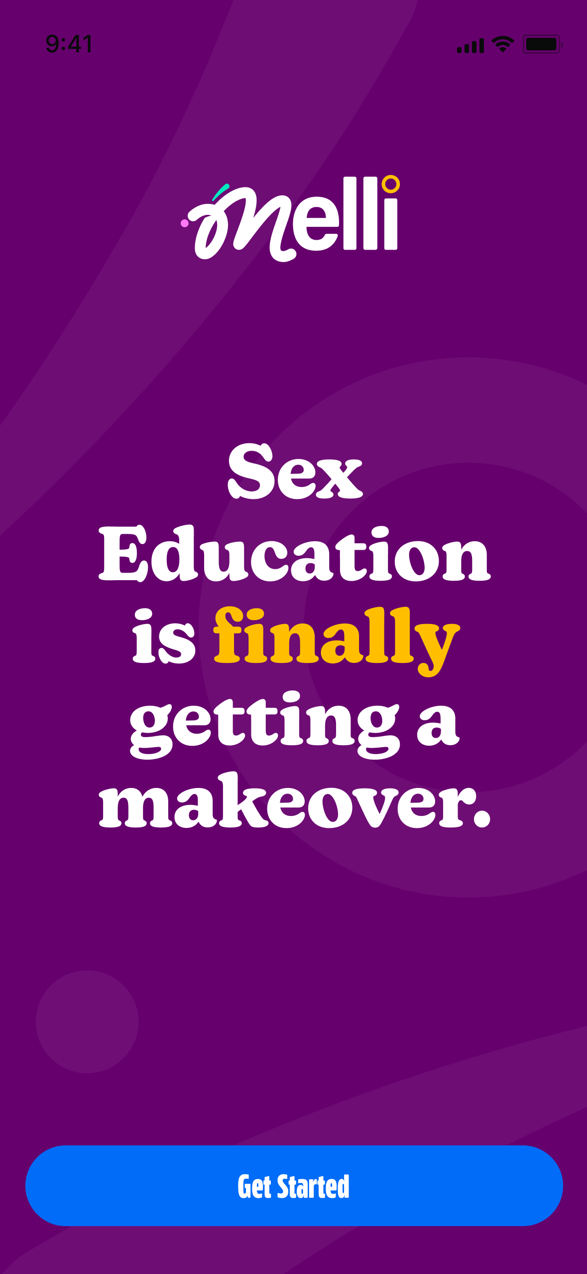
Melli
Role: Lead Product Designer & Product Manager
Team: Product, Engineers, Content Designers, Medical Advisors
Duration: 0 → 1 (concept to MVP)
Tools: Figma, Surveys, Interviews, Roadmapping, Prototyping, Usability Testing
Overview
Melli is a mobile app designed to help parents educate their daughters about sex, hygiene, and their bodies in an age-appropriate, trustworthy way. The product empowers girls to understand what is normal, ask better questions, and advocate for their health, while giving parents control, transparency, and confidence in the information being shared.
I led Melli from initial concept through validation, product strategy, experience design, and MVP delivery, owning both product and design decisions end-to-end.
Problem
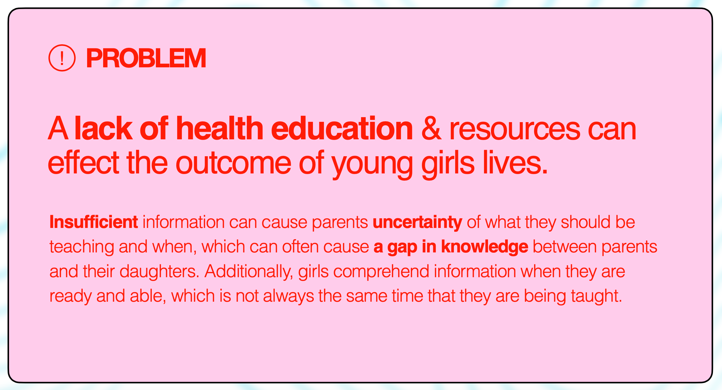
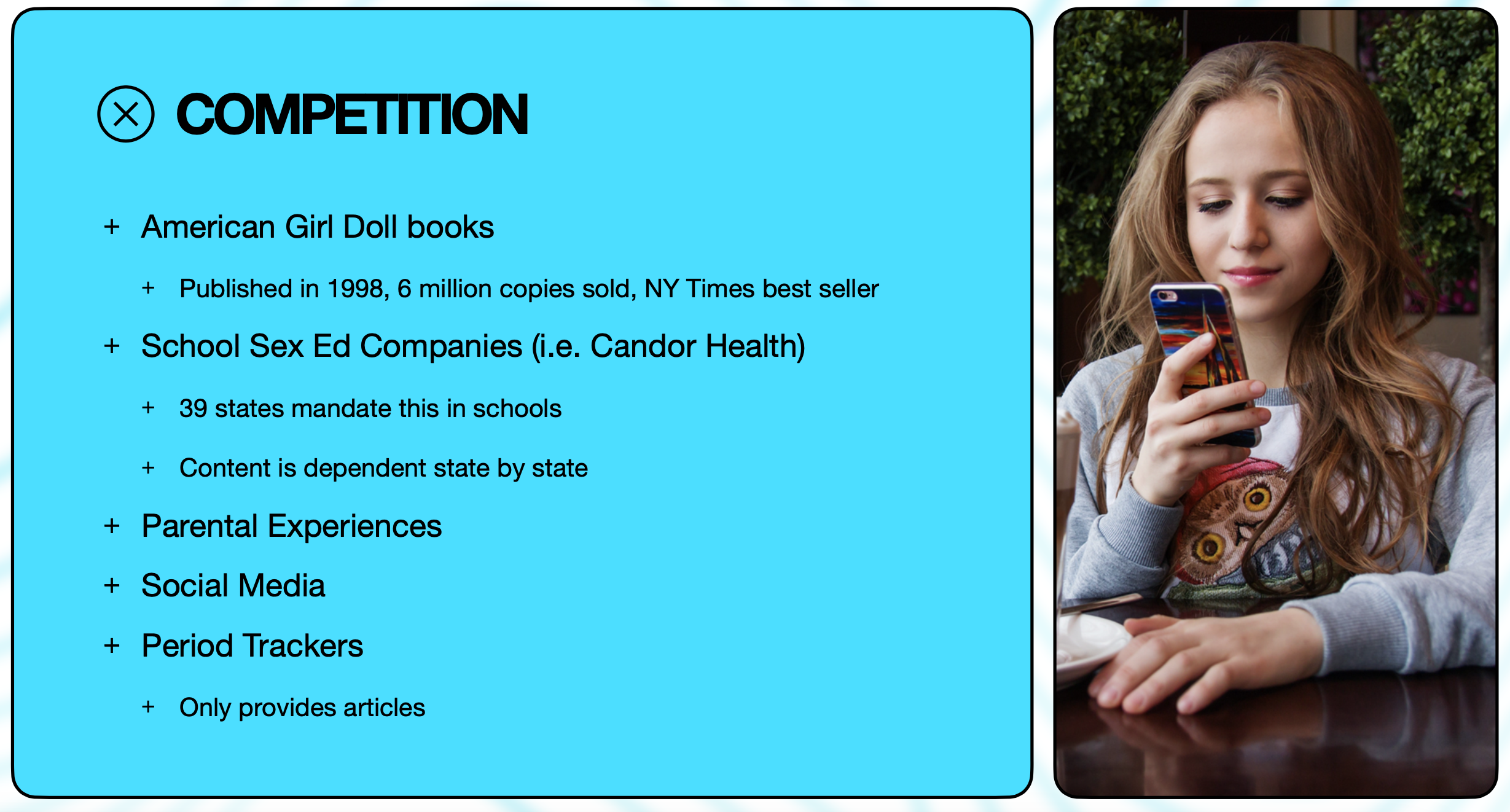
Girls are not being adequately prepared to understand their bodies or advocate for their health.
Through research, we found:
Schools are not required to teach accurate or comprehensive women’s health information.
Many girls learn about sex and health through social media, rumors, or incomplete sources.
Parents often assume schools will cover these topics, or wait for their child to ask questions.
Girls frequently don’t know what questions to ask because everything is new.
Even when parents teach the right information, children may not retain it if they aren’t developmentally ready.
The long-term impact is significant: women’s health issues often take 10–30 years to be properly diagnosed, largely due to gaps in early education and self-advocacy.
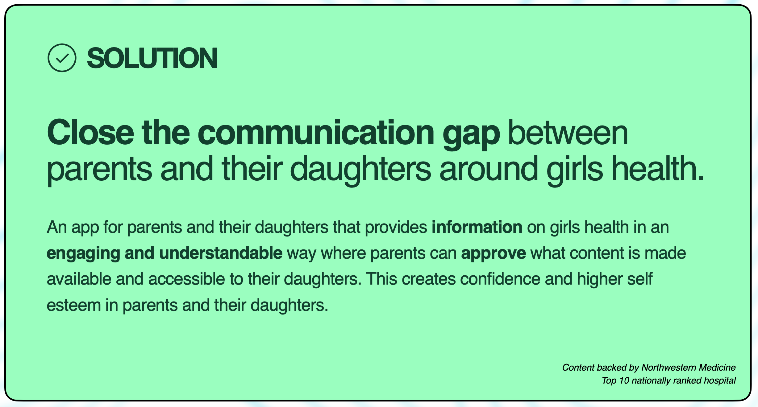
Solution:
Research & Insights
I conducted mixed-methods research with 300+ participants, including parents and women reflecting on their own childhood experiences.
Key findings:
0/300 women felt prepared for their health or sexual education growing up.
0 parents reported having a trusted, comprehensive resource to rely on.
Girls reported learning primarily from social media, peers, or fragmented sources.
Parents wanted to help but lacked tools, structure, and confidence.
Retention was a major issue—information taught too early was often forgotten.
These insights shaped both the product mission and the experience design.
Product Goals
Provide medically accurate, trustworthy health education
Allow girls to learn independently and alongside a parent
Give parents full control over content access and timing
Support repeat learning so information can be revisited over time
Present sensitive topics in a warm, approachable, and age-appropriate way
Requirements
Based on research, the product needed to:
Organize content into clear, scannable categories
Allow parents to turn content on/off by topic
Enable parents to add their own custom content
Be visually engaging with a witty, non-clinical tone
Support independent exploration while maintaining parental oversight
Ensure all content is medically reviewed and approved
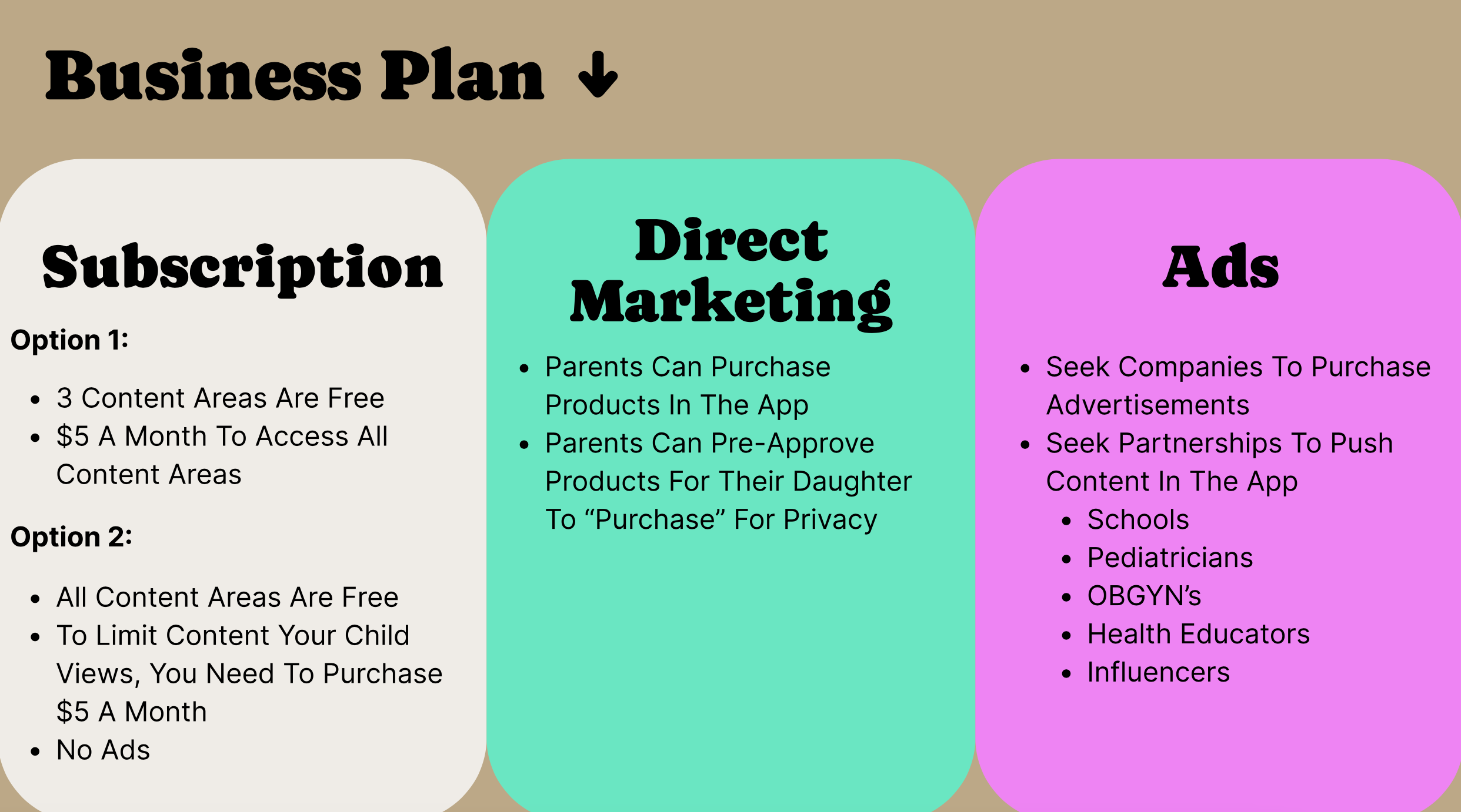
Solution
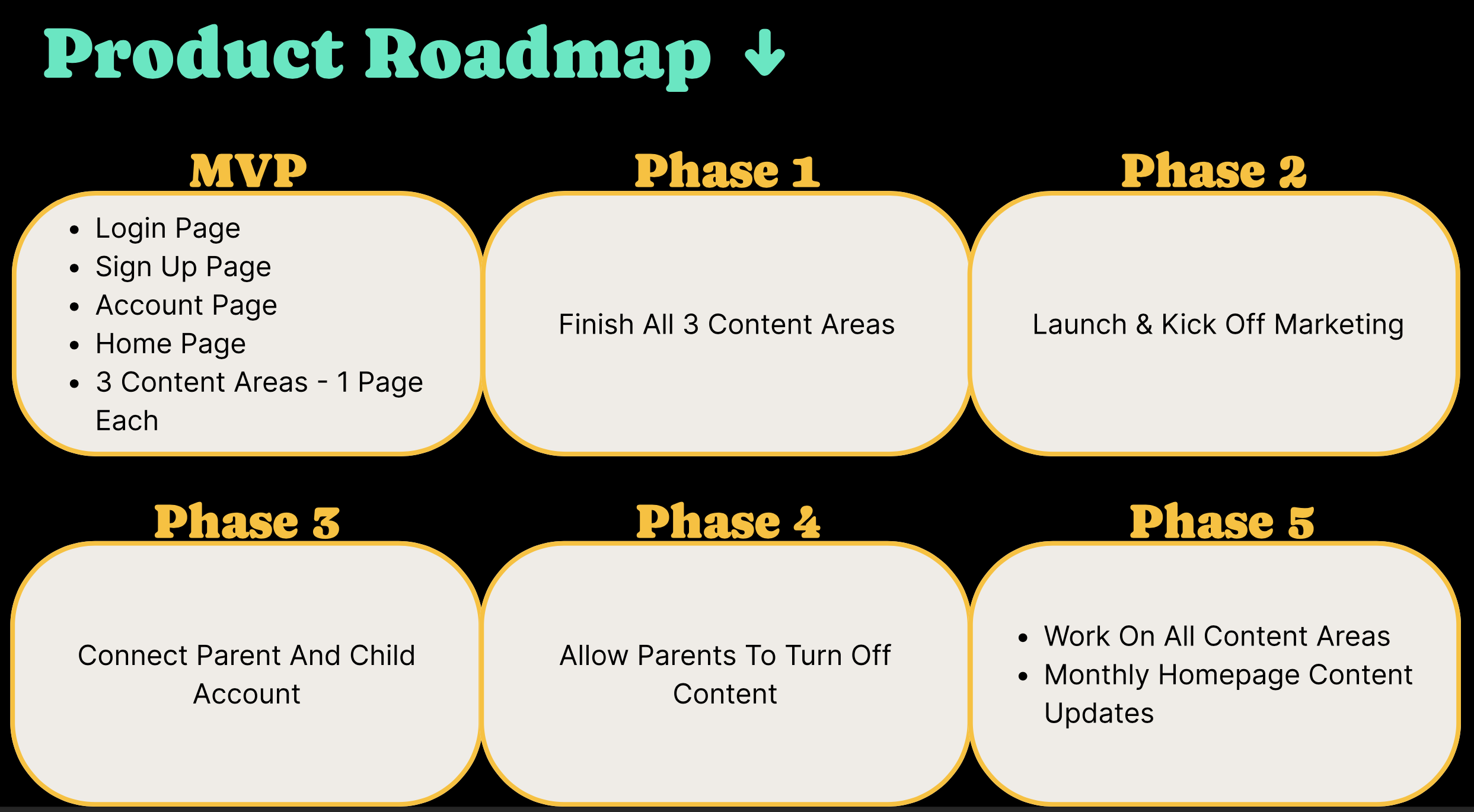
I designed a phased product strategy to validate the concept, reduce risk, and support long-term growth.
Phased Rollout
Phase 1 (MVP)
3 core content areas
Parent-only experience
Subscription model
Focused on validating trust, tone, and usability
Phase 2
Expanded content categories
Improved navigation and discovery
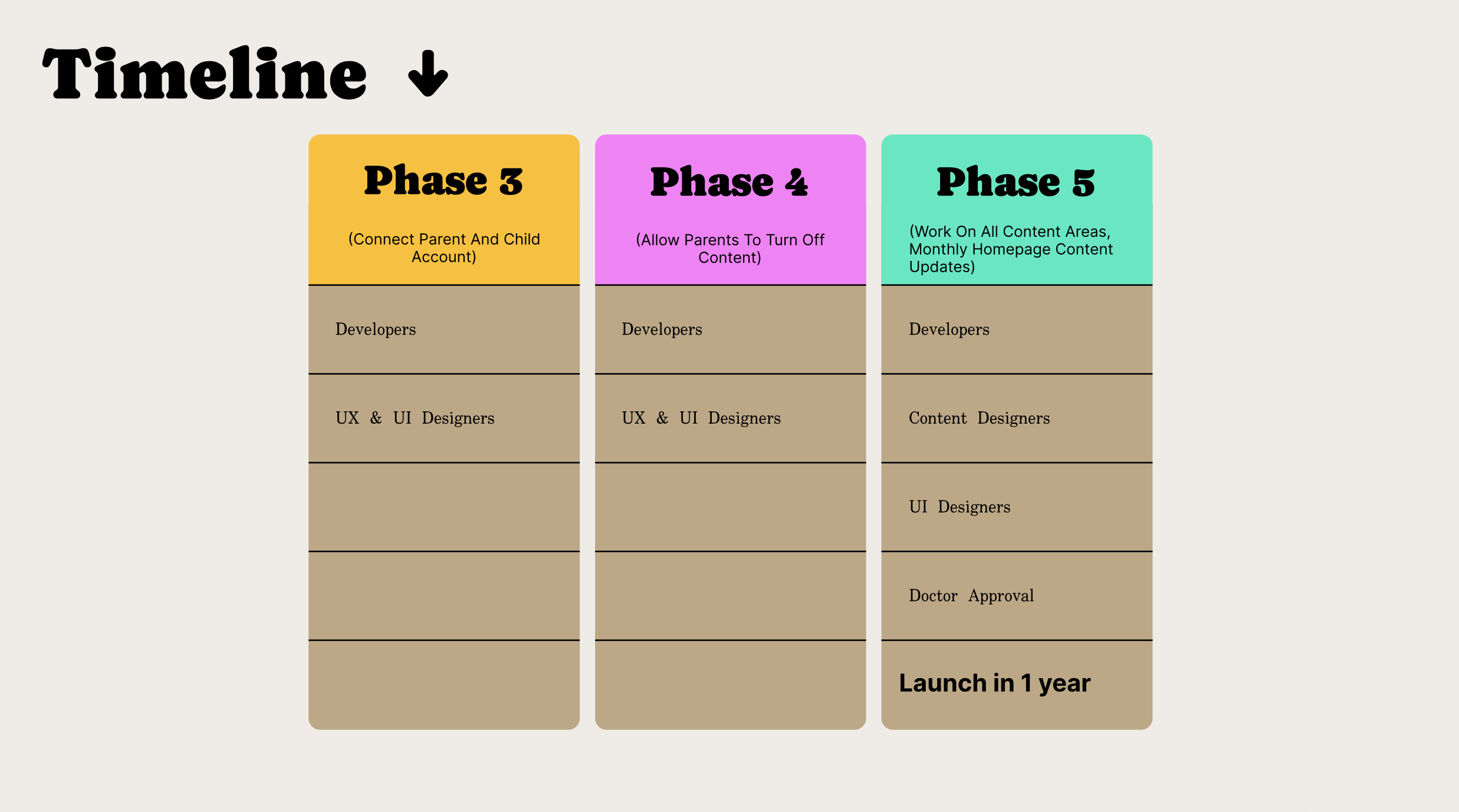
Phase 3
Child-facing experience
Independent learning with parental guardrails
Phase 4
Parent controls to enable/disable specific topics
Custom content added by parents
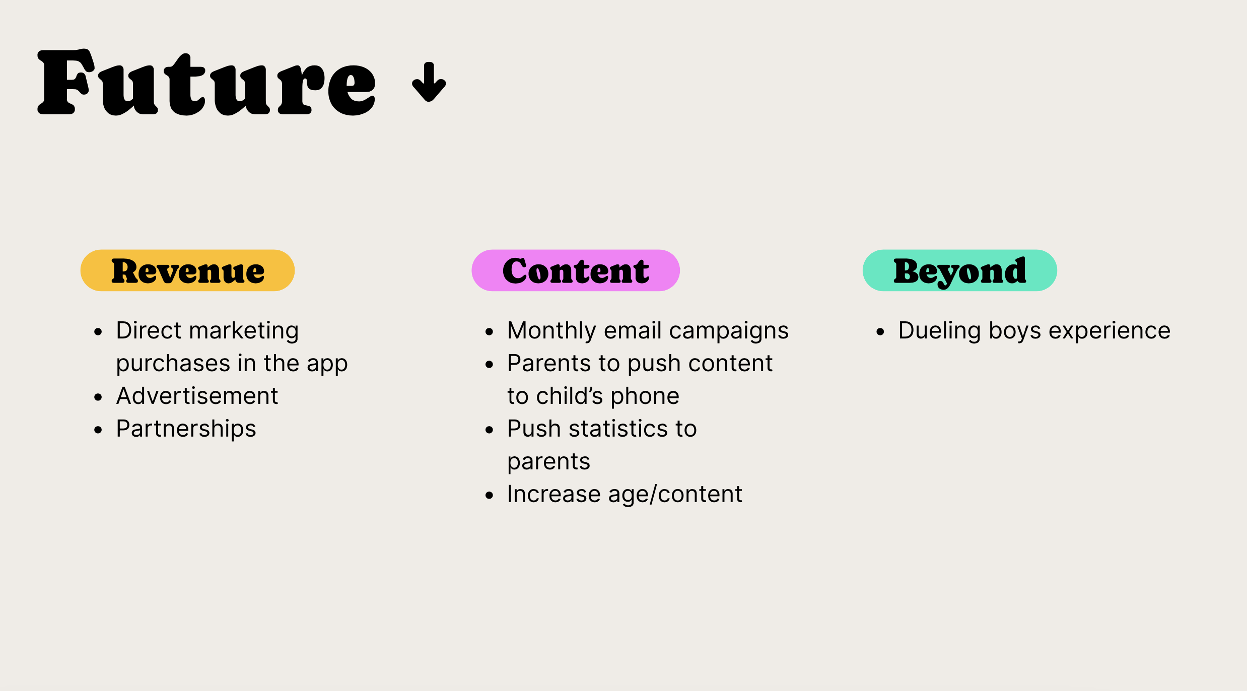
Phase 5 (Future)
Optional, parent-approved product recommendations
Parents control purchases or allow child-initiated requests
Product Artifacts
To validate the concept and reduce risk, I developed the initial product narrative and phased roadmap. Below are selected artifacts showing how research insights translated into product strategy and MVP scope.

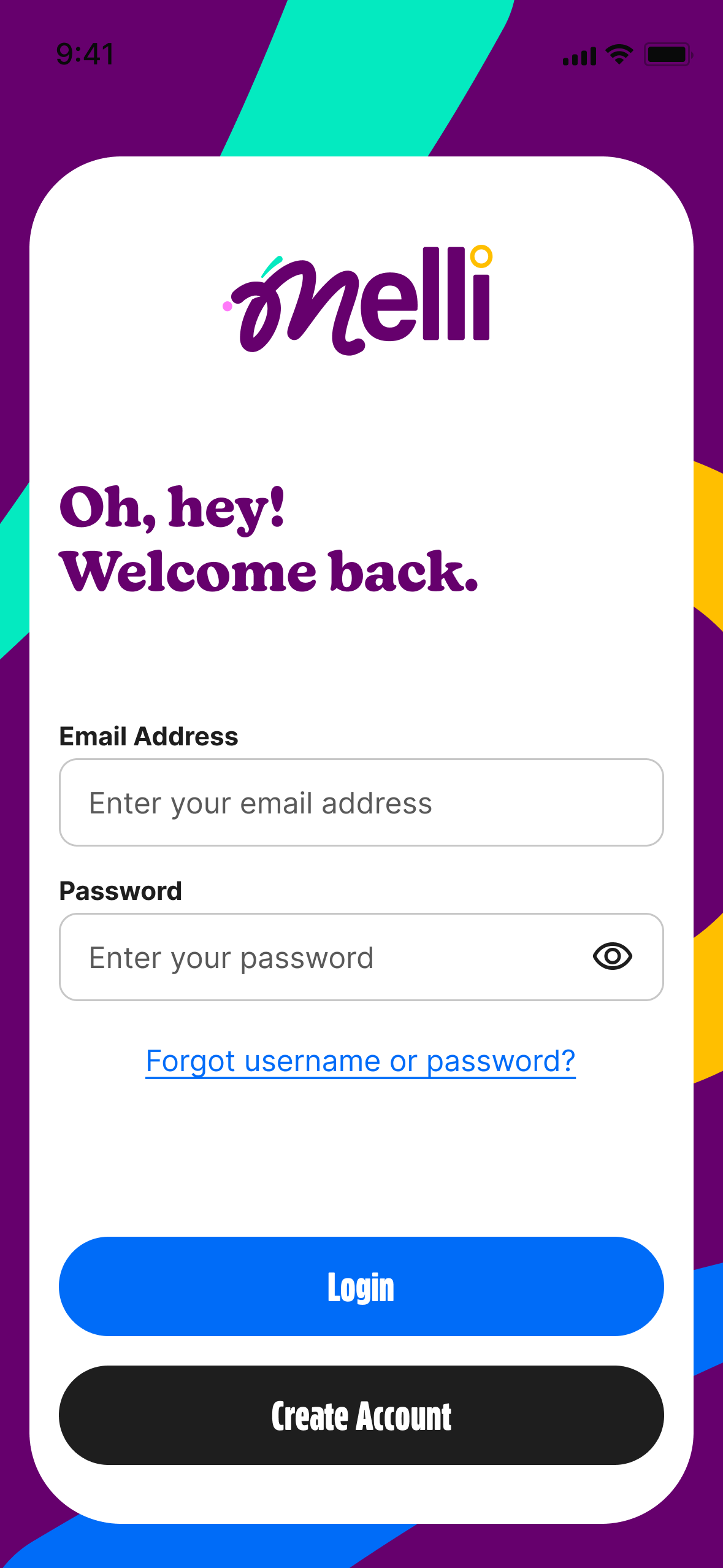
MVP
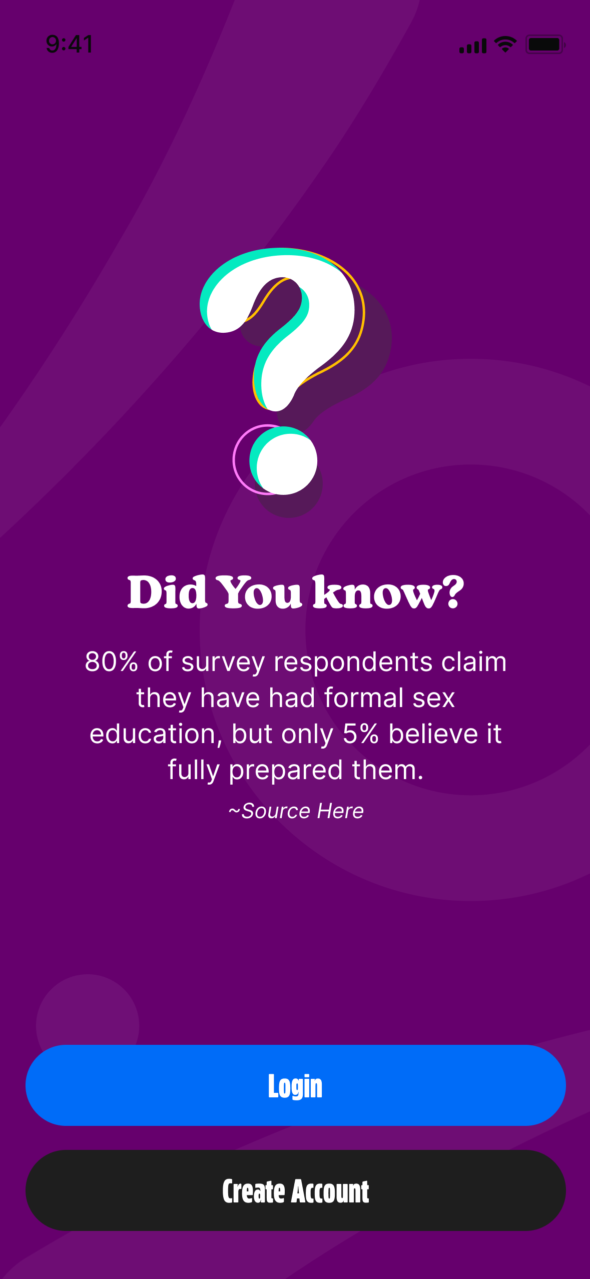
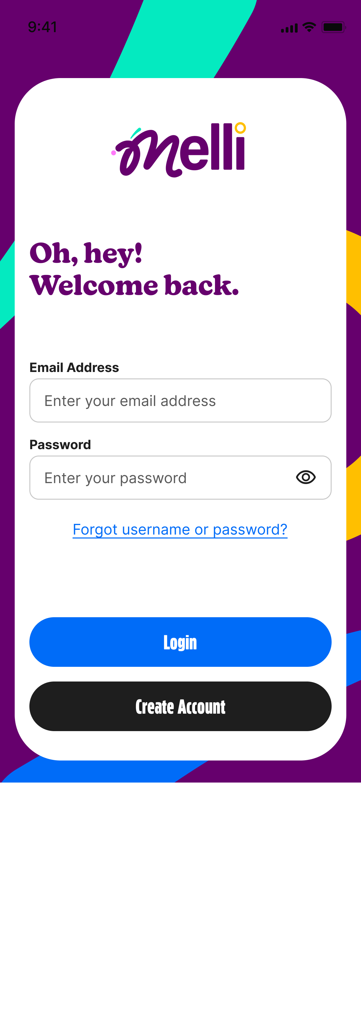
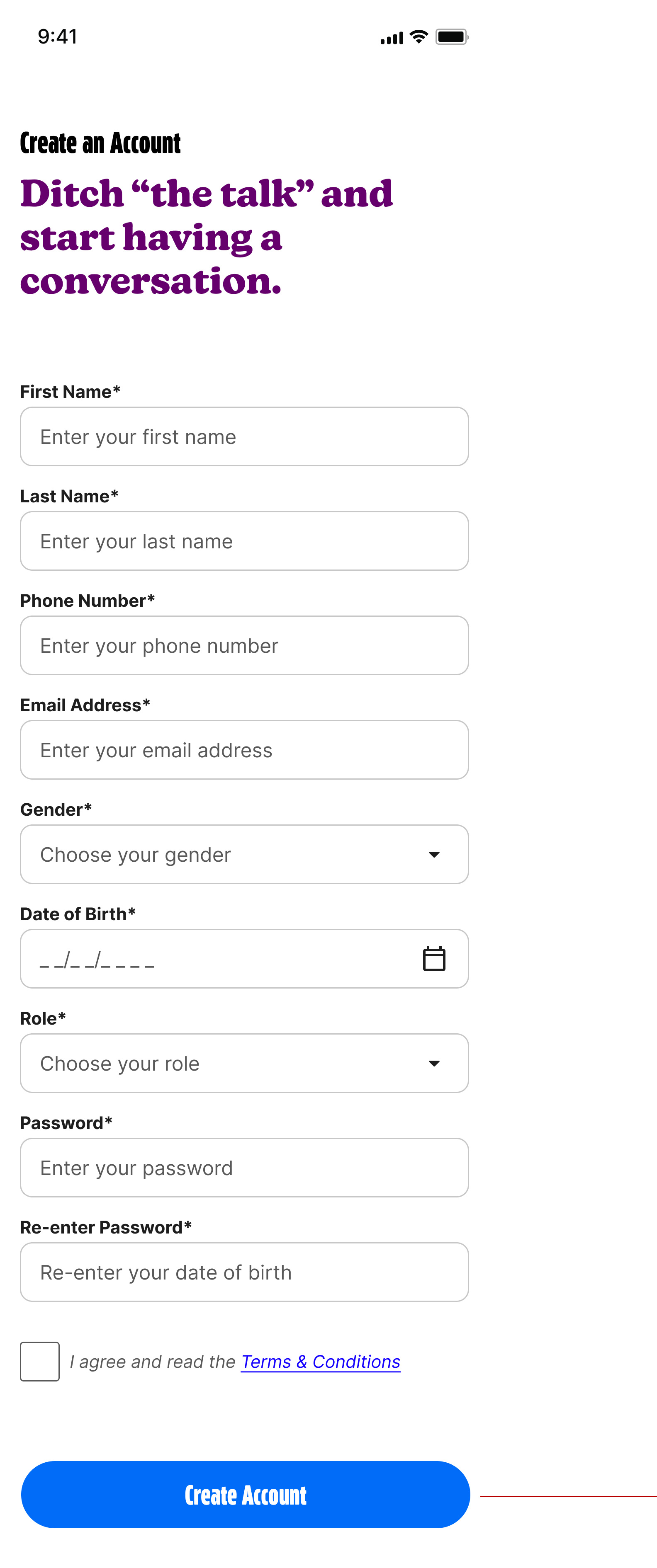
The MVP focused on validating trust, tone, and usability with a parent-only experience before introducing child-facing functionality. Early prototypes were tested with parents and age-appropriate users to ensure the content felt approachable, respectful, and easy to navigate.
Usability testing showed strong positive responses to the brand voice, color palette, and visual tone. Kids responded especially well to the friendly, non-clinical language and softer visual styling, which helped reduce discomfort around sensitive topics. Parents noted that the experience felt modern and safe without being overly medical or patronizing.
One key insight from testing was around content pacing and structure. Early versions presented too much information at once, which felt overwhelming for younger users. Based on feedback, we iterated by breaking content into shorter, scannable sections with clear entry points, making it easier for users to absorb information and return to topics over time.
Testing also revealed the importance of shared context between parents and children. We refined content previews and topic descriptions so parents clearly understood what their child would see before enabling access, increasing confidence and adoption.
These iterations helped validate the MVP direction and informed the phased rollout of additional content, controls, and child experiences.